2. Vision & Perception
In 1872, a painting was painted. Now, in the 1800s, lots of paintings were painted. But this particular one was an important one—and not just because it’s my favorite painting of all time. This painting is Claude Monet’s Impression, Soleil Levant (Figure 2-1) and I love it, in part, because it embodies the Impressionist movement, one of the most beautiful—and beautifully dysfunctional—marriages of art and science in history. I’m going to spare you the full meandering history of Impressionism and post- Impressionism, but I’d implore you to do some further reading if you’re in any way interested in art, bohemia, or anarchy. What is important to understand is the insight Impressionism gives us into some of our brain’s perceptual processes.
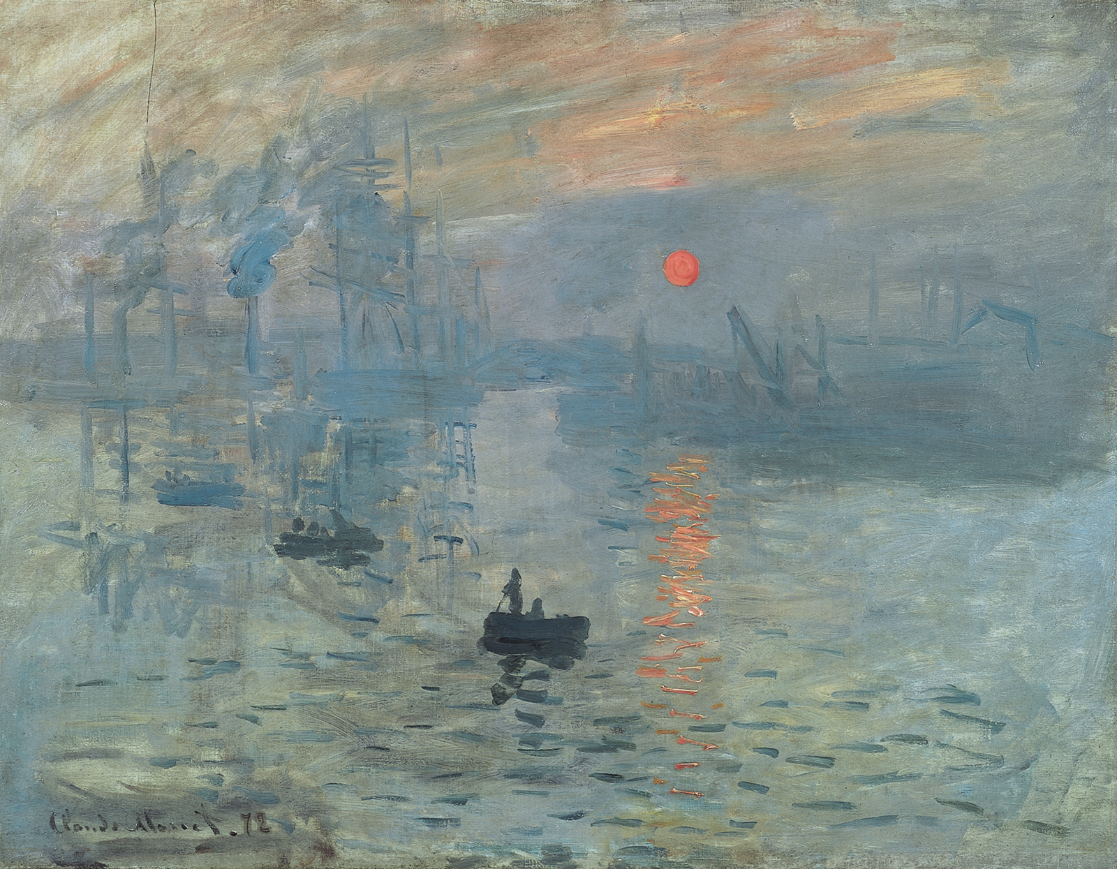 Figure 2-1. Claude Monet, Impression, Soleil Levant—1872, oil on canvas, Musée Marmottan Monet, Paris (Public Domain)
Around the same time that Manet, Monet, Bazille, Renoir et al. were hunched in Cafe Guerbois, twizzling fancy mustaches, cursing the memory of Napoleon, and plotting the downfall of the bourgeoisie (the “Batignolles” were reportedly staunch anarchists and bohemians), science was making its first strides into understanding the separation between sensory input and perception. Namely, we were just coming to terms with the fact that what we see, is not what we see. How cryptically enticing.
In the previous chapter, we touched on the idea that the brain is concerned with regulating—most importantly, saving—mental resources. It’s also incredibly adept at pattern recognition and we’re able to perform a whole suite of perceptual shortcuts and acts of visual field organization to make sense of our environment.
While our understanding of the intricacies of perception has become more refined, more rounded, and deeper than these seminal discoveries and theories, the science ‘du jour’ in the late 1800s still rings true: the eye and the retina are only half of the equation when it comes to visual perception. Without a form of organization and resolution in the mind, the things we “look at” would be perceived as little more than visual mush. Impressionism played to this reality and embodied, to its core, the true nature of human perception. Perception is how we organize our environment, how we take what we sense and transform it into something meaningful in what we perceive—and it is hugely impacted by our own experiences of the world. What we know, what we expect, and how we feel all influence what we perceive.
Vision is the bottom-up sensory process of transmitting light information from our environment to the brain. Light is captured, turned into neural signals, and then sent to the brain for processing. This is vision. The brain then applies some form of order to these signals— it catalogs, organizes, and contextualizes the discrete elements of what we see into objects with meaning and interrelatedness. This is perception, and everyone’s perception is different. It’s theorized that varying amounts of this sensory data are lost before they even reach the visual cortex of our brains, thus, what we actually perceive once visual information has done its eclectic round-trip to the brain is actually often informed by assumptions and hypothesizing—a kind of best guess combination between objective visual signals and assumptive fill-in-the-blank mental mystery solving.
When you look at Impression, Soleil Levant, what do you see? I see a river; I see a few scattered boats with people in each, some seated, some standing; I see birds in flight over the river; I see a bridge, a sunrise, and the reflection of that sunrise in the water. I see a living scene—a moment in time. Remove the romance though, look slightly closer, and it’s really a whole mess of visible brushstrokes and vaguely-rendered forms. Even now, Monet’s work looks almost unfinished—form is hinted at and suggested rather than meticulously rendered and there’s a gritty, primal, textural nature to the work. At the time this style was shunned, almost heretic in its brazenness.
Before Impressionism, fine art was on a crusade of realism. Brushstrokes were deft and unnoticeable; art was aspirational and hyper-realistic; important people were painted in important situations; and the mainstream, audience at the time, was—quite ironically—rooted in the avoidance of harsh reality through escapism. The Impressionists sought to bring their own form of realism to art; to bring it down to earth; to paint the peasants and the bohemes; to capture the purity of moments, not the glutton of fantasies. To paint these moments—to acquiesce to the ephemerality of natural light, to paint with an obsession for minimizing brushstrokes, to immerse oneself in a fluid, shifting environment— was to realize, on canvas, the nature of human perception. To me, Impressionism embodies a notable array of the modern quips and knowledge we have in design, through its striving for minimalism and its refusal to patronize.
There’s certain magic to this work, along with the neo- and post-impressionism and abstract art that followed it, and that magic lies in just how well it lays bare the workings of our mind’s eye. When we observe a work like this, we’re almost compelled to insert ourselves into it. The soul of an Impressionist painting cannot be found on the canvas; it’s in the mind of everyone who’s filled in its blanks. Impressionism and abstract art only truly occur in our minds. We use our past experiences and our knowledge of the world to extrapolate form into meaning. There is a visceral, individual component to experiencing a piece of art that, for me, has never quite been captured better than in the masterpieces of the Impressionist movement. Without this extrapolation, we would see art how we would see the world without perception—as a mess of lines and color and incoherence. Impression leaves room for our own affect, our own emotions—it is exploration on canvas, and it has changed art forever.
The Iconic Abstraction scale
Creeping further toward modern day now, in his quite excellent book Understanding Comics, Scott McCloud theorizes that the more “iconic” an image is, without losing its meaning, the higher chance that we’ll apply to it some of our self by attaching our own inferences. Similar to the act of observing Impressionist art, when we see simple illustrations, we’re asked to fill in some blanks and to come to our own conclusions. McCloud uses the term “iconic abstraction” to denote the level of deviation from real- world form—the premise being simpler, more cartoon-like forms represent higher levels of iconic abstraction from a real object than, for example, a photograph. (See Figure 2-2.)
 Figure 2-2. An example of iconic abstraction: going from realistic (left) to iconic (right.)
While there’s little in the way of empirical evidence for this theory, I do believe it’s a wonderful meditation on just why we’re so enamored with the abstract. Artworks that, without our ability to fill in blanks and create associations, would essentially be discarded as a cacophony of lines and brushstrokes become something more than the moment or object they seemingly nonchalantly represent. There exists enough conceptual space in these works for us to impart our own ideas and weave the threads of our own stories. I’ve long said (while acknowledging the inherent bias from the fact that some of my favorite humans are illustrators) that illustration is one of the most integral aspects of a modern brand, website or interface, and I think McCloud’s theory and our willing cultural embrace of impressionist and abstract art gives us a hint as to the real power of emotional illustration.
Furthermore, what we see when we look at these works actively changes based on our working mental models of the world. Ask yourself this: when looking at Impression, Soleil Levant, how—do you imagine—would your perception of this image change if you were familiar with the river on which it is based? If, as part of your daily routine, you spent every afternoon in the Le Havre port, saw endless sunsets like the one depicted, and attached endless memories and associations to those moments? Conversely, what if you’d lived a life in which you had never seen a boat or even a bridge? How would you make sense of Monet’s work without the requisite mental model? This is the power of abstraction. It nods toward a form that cannot exist without the inferences of our mind’s eye. It’s why we can see the sunset and its reflection in Monet’s masterpiece, or the seemingly bemused face in that doorknob we walk past every day, or Jesus Christ burned into our toast. When there is a form to be found, we will usually find it. (See Figure 2-3.) In fact, even when there is no explicit depiction of form, we can always convince ourselves there is.
 Figure 2-3. Can you unsee the “face”?
Iconic Abstraction in Design
Presenting people with simple visual language is integral to usability. Modern product design, especially, makes heavy use of iconography, often at sizes as small as 16px squared. While it’s possible to convey a surprising degree of complexity inside a seemingly minuscule canvas, great icon designers are experts at using just enough visual density to simultaneously communicate meaning and personality. Even larger, so-called macro icons and product illustrations make use of this willingness from humans to fill in the blanks when presented with visual information.
In websites and print material, we’re far more likely to encounter photography and higher-fidelity illustrations, tapping in to mimetic desire—the notion that we don’t really desire something until we see another human doing or using it. We constantly compare ourselves to others, for better and for worse, and seeing powerful, happy, and competent people can really hit home emotionally—provided the subjects are relatable enough for your audience. Another huge factor, especially with aspirational photography, is that of diversity. If you’re using photography in an attempt to uplift and empower and you omit an underrepresented group, you’re making a pretty plain and clear statement that you don’t care about that group’s members. The whole act of one’s relating to a piece of media relies on the ability to find or place a manifestation of one’s self within. If your imagery excludes, your potential impact diminishes. That’s not to say that by simply adopting a more iconic approach that you magically have no commitment to representation—just that the effects are starkest with the representational nature of photography.
The level of abstraction we want to use in our work will vary greatly depending on context and content around which we’re designing. It’s probably unwise to replace detailed, meticulously-directed product photography on the Nike store with a rough sketch of a pair of shoes worn by a smiling stick person—although it would definitely be a brave brand decision. When we do have the luxury of choice, however, it can be greatly rewarding to simplify your illustrative forms to reach the levels of self-imposition that comics, cartoons, and even impressionist art allow for.
Simpler visual language is also often less cognitively taxing than its more realistic counterpart, allowing us to use fewer pieces of visual information to convey meaning and creating more recognisable, memorable signifiers. Now, this doesn’t mean that we should necessarily simplify to the point of abstraction—go too far towards abstract and you exacerbate many of the problems you’re trying to solve; with overly-simplified, vague and confusing forms requiring a second or third glance to figure out just what the heck we’re looking at. We must also consider personality and brand in this equation too. Having everything in its simplest possible form—whether we’re talking about entire interfaces or smaller product illustrations—can easily become boring and insipid. Making decisions appropriate to our audience and subject matter is, of course, paramount; but more engaging, dynamic, colorful, or otherwise personality-laden illustrations and icons can really bring a simple interface to life.
The pursuit of simplicity will be a common theme throughout this book, but take it with a pinch of salt, and remember that this push for simplicity does not exist in a vacuum: the sites and apps we’re most exposed to are often grossly dense, full of adverts, or embodiments of feature creep—almost universally tailored towards neurotypical audiences. Pushing too hard for simplicity can lead to insipid environments full of drab elements and monotonous interactions. People deserve fun things, especially when they’re tastefully done. Don’t skimp on whimsy or personality—most products are better for it. Context is, of course, key here. Adding playful interactions and a cute grim reaper mascot to a funeral home contact form is probably not the best approach; but even boring-sounding products like Enterprise User Management Solutions as a Service or some other random thing over caffeinated dudes in ties try to sell can be embellished with a bit of edge and fun. The key thing to remember is that simplicity is not a heuristic for mundanity. In fact, the better you get at designing simple baselines, the more freedom you have to sprinkle in some fun and personality. Do this with intent and with good reason and you’re golden.
The Gestalt Principles of Visual Perception
To understand how we can arrive at the kind of simple, harmonious baseline we keep blabbering on about, we first need to understand how we perceive our environments in the first place. The Gestalt Principles of Perception are a set of guidelines that aim to explain some of the inherent biases and approaches humans apply as part of our environmental perception.
Gestalt is most effective at explaining how we look to group elements of our visual environment. As you progress through this book, you’ll see time and again how important groups and categories are when it comes to navigating the world. We explored this a little in the previous chapter when we looked at how the mind uses affordances and mental schemas to contextually group objects and make decisions against whole groups. We do this in a more ambiguous visual sense all the time, and the easier our visual environment is to chunk away into groups, the more efficient we can be with our attention and decision-making.
Understanding Gestalt will make you a better designer. There are quite a few concepts in this book that I’d optimistically lay claim to being designer improvers but we’re about to dive into something so fundamentally linked to design that you’d struggle not to do better work through developing a practical understanding of it. Practicing how to use visual organization and styles to infer groupings and interrelatedness is the nucleus of any good visual design. Learn Gestalt and how to use it well and you’re well on your way to designing consummate visual interfaces.
Proximity
The Gestalt principle of proximity states that objects that are closer to each other are seen as grouped. This is probably the universal principle of visual design and goes a good way to informing why whitespace and layout are so integral to harmonious design. Figure 2-4 shows proximity in effect—chances are you’ve naturally grouped these objects based on proximity alone.
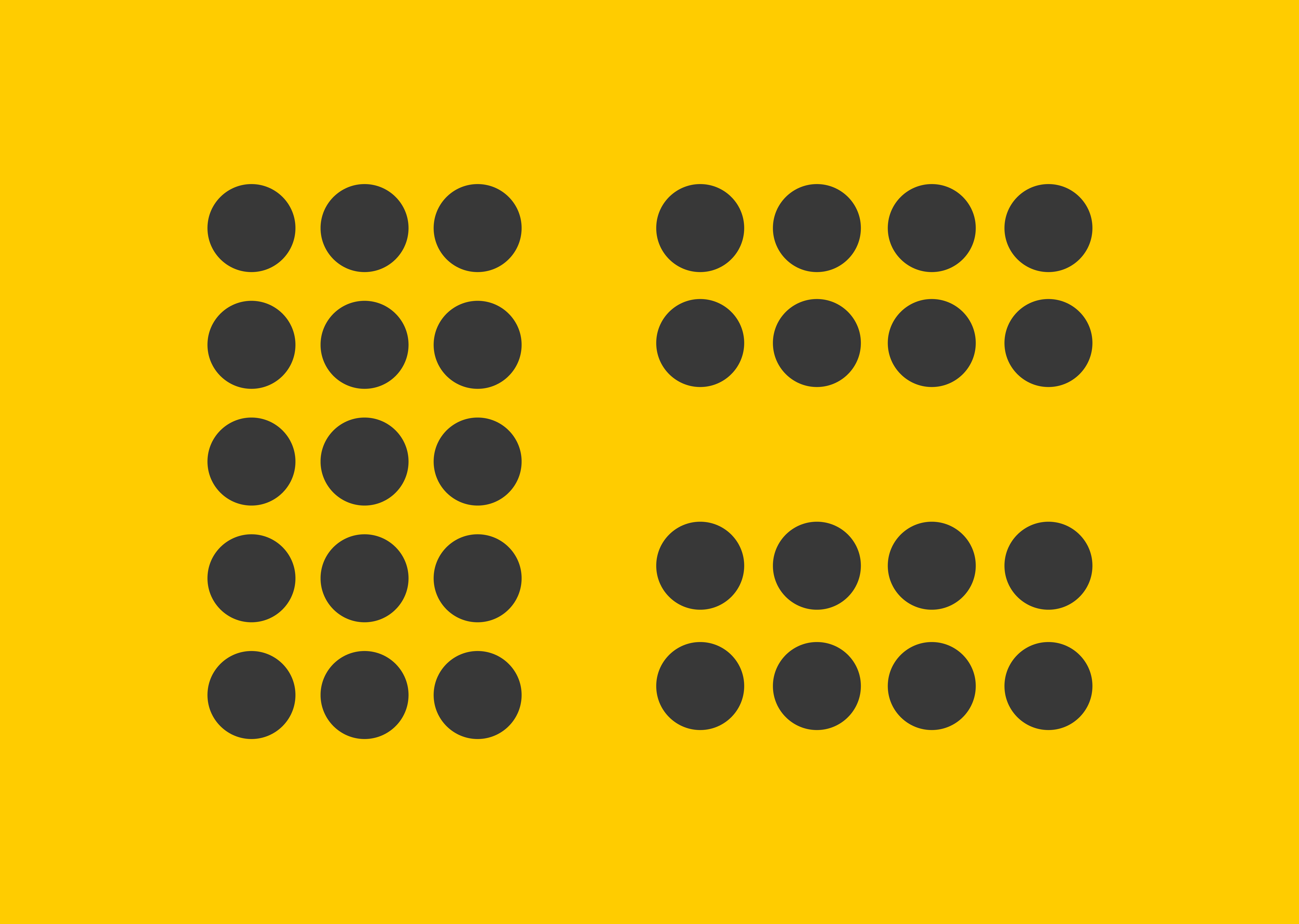 Figure 2-4: Proximity in action
In design, proximity informs some of our most basic guidelines. For example, when setting type, ensuring that a heading is closer to the paragraph it introduces than it is to the preceding paragraph (Figure 2-5) enforces the relationship between the two, detaching it from the less-relevant content.
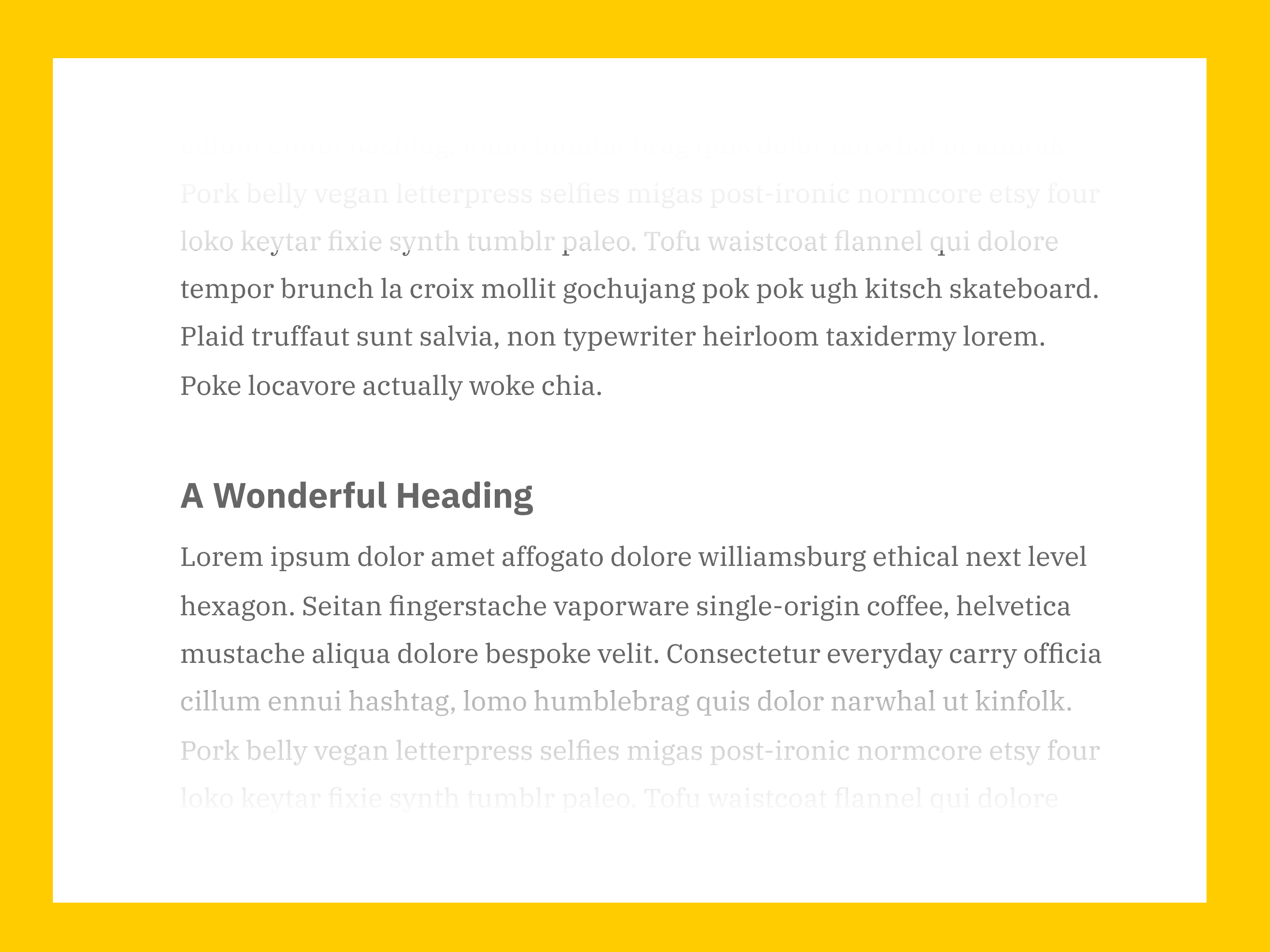 Figure 2-5. The heading’s proximity to the second paragraph indicates relatedness, as does its relative separation from the first paragraph
The power of understanding this principle lies in the fact that it allows us to communicate grouping, structure, and hierarchy without adding any extra elements to our designs. Many simpler designs can communicate relationships and hierarchy through proximity alone.
Figure 2-5. The heading’s proximity to the second paragraph indicates relatedness, as does its relative separation from the first paragraph
The power of understanding this principle lies in the fact that it allows us to communicate grouping, structure, and hierarchy without adding any extra elements to our designs. Many simpler designs can communicate relationships and hierarchy through proximity alone.
Challenge: proximity in action
Build up a practical understanding of proximity principle by taking a screenshot of an interface and marking out what you believe to be grouped based on proximity. Try to mark out and label each group. Find as many good—and bad!—examples as you like, taking into account how obvious the grouping is, and whether it makes sense to visually group such elements. You’ll be surprised how often proximity is used poorly to create confusing visual environments!
Similarity
The Principle of similarity suggests that items with similar appearances and physical qualities will be grouped together. When you look at Figure 2-6, it’s quite likely that you’ll categorize the shapes into vertical columns of circles and triangles.
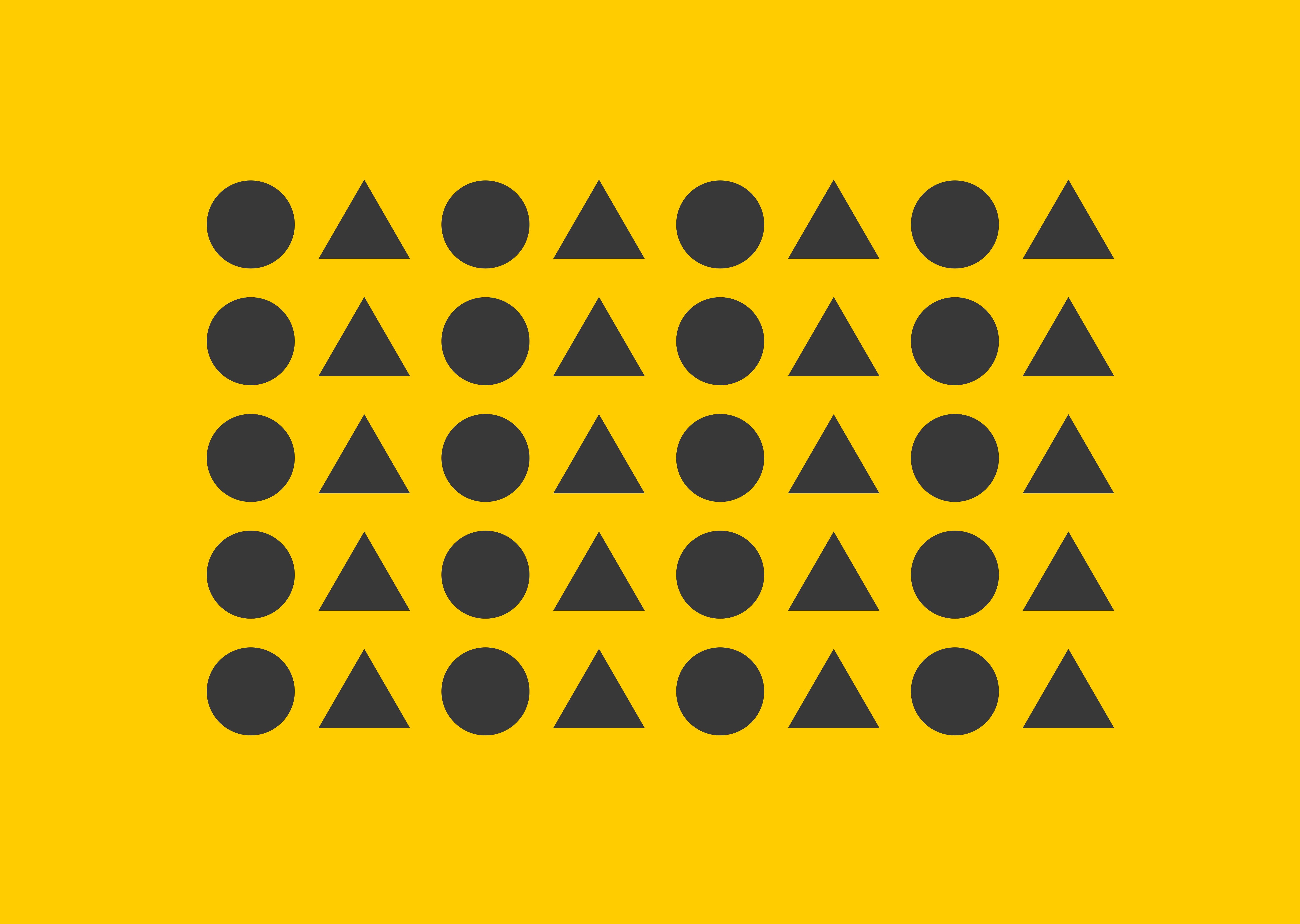 Figure 2-6: Similarity in shape language enforcing the perception of columns
Even though the shapes are spaced equally and are of roughly the same visual weight, your brain groups them together by their most obvious similarities. In Figure 2-7, however, it’s much more likely you’ll perceive horizontal rows of different shapes.
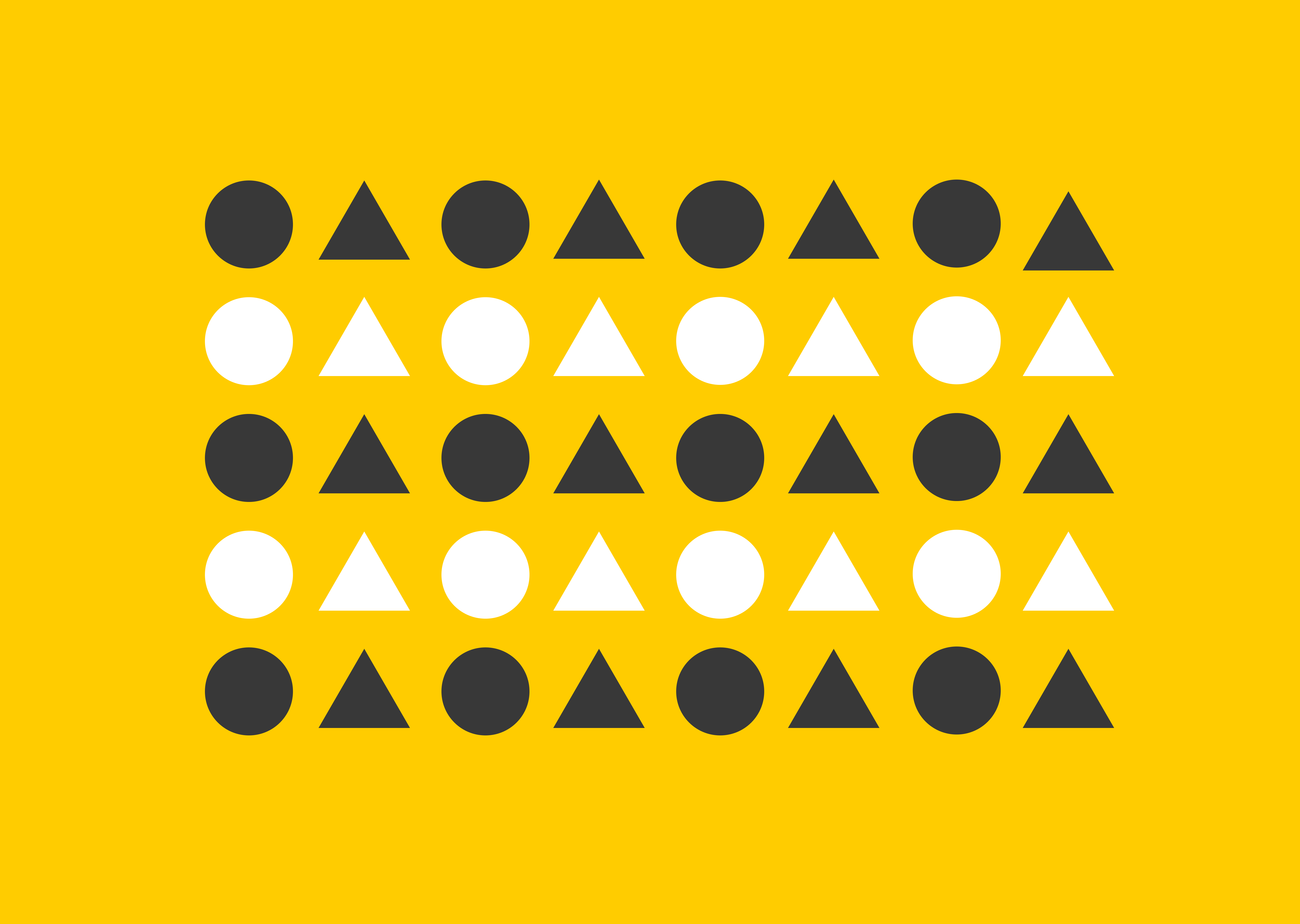 Figure 2-7. Color similarity overriding the initial perception of columns and instead suggesting rows.
In this case, we observe something rather elemental to Gestalt: the degree to which something adheres to a principal is often just as important as the principal itself. In the above example, while the objects could easily be read vertically as alternating columns of circles and triangles, the inclusion of a more obvious similarity across the horizontal axis—a stark contrast in colour compared to a relatively subtle differentiation in shape language—promotes an entirely different observed structure. Things aren’t just a binary of similar or not similar, they’re more similar and less similar, or closer together and further apart. Naive binaries make for great posters and great examples in a book, but they’re not indicative of the complex visual environments we navigate every day, on and off screen.
Indeed, these examples are atomic, and you’ll notice there’s an element of proximity at play in making both of these examples still feel like self-contained wholes. Similarity doesn’t usually play out like this in UI design, and is far more often used to link certain visual qualities to semantics or action possibility. Let’s take the humble button as an example. There’s a touch of real-world metaphor going on (although modern buttons don’t tend to rely so much on the verisimilitude of skeumorphism to appear like photo-realistic examples of real-world buttons) and a boat load of convention—buttons are everywhere in digital design—but similarity allows this meaning and convention to prosper in the first place.
While button style might differ subtly between applications based on things like brand identity, market standards, and user preference; most buttons will have similar traits that make them recognisable. They’ll usually be a rectangle—perhaps rounded to some degree—with either a border or a background color to provide contrast and differentiate it from normal interface text or icons. Sometimes they’ll have a shadow, or a gradient background, or any other visual flourish that felt buttony at the time of design. If they’ve been designed well, they’ll also have clear hover, active, and focus states to correctly communicate various phases of interactivity. Most importantly, though: they’re recognised and codified as interactive elements, and share traits with every other button in an interface. While things like the background color (primary vs secondary buttons, or a delete button being a ‘danger’ color are good examples of this) or elevation might differ, they will all have tonnes more similarities than differences.
This gives us a sense of cohesion, predictability and balance when we design. Think how chaotic an interface would be if every button had a different shape and colour treatment! Ensuring a degree of similarity between things like buttons, icons, and alerts makes our interfaces more cohesive and predictable. This is one of the primary forcing functions behind design systems—similarity and consistency at the most atomic level of a designed interface provides a platform from which we can create seamless, coherent environments.
It’s this consistency and predictability that lets us codify different qualities of interface components and, in doing so, infer meaning or potential action based on the visual and aesthetic qualities of each component. Our brains are constantly making predictions based on qualities—visual or otherwise—of objects in our environment in order to chunk objects and conserve energy. Adhering to this with intelligent and appropriate use of similarity is the backbone of any well-made interface.
Challenge: similarity in action
Find or create examples of similarity being used in various contexts. Consider how things like button shape, border radius, padding, line width and typographic consistency create harmony within an interface. Then do the opposite! Take or create a somewhat complex UI screen, and mess it up completely by making every element unique. Continuity
While proximity and similarity encompass many of the basic concepts we use most commonly in design, they don’t fully account for one of the most important: “alignment.” The Principle of Continuity suggests that elements that are aligned with each other are perceived as grouped due to our natural desire to visually “follow through” an element along a specific path or in a specific direction, as seen in Figure 2-8.
 Figure 2-8: Continuity helps us group the top row of elements together—the second row, not so much
The first row in Figure 2-8 shows an extremely common row of elements and, while proximity and similarity have a say in their grouping, possibly the strongest indicator that they’re a group is their alignment along the vertical axis. The second row shows a rather exaggerated misalignment between the elements, making it much more difficult to perceive them as a group. Continuity can be enhanced with flowchart-style lines or arrows or hinted at with smaller design flourishes should you need to communicate a cohesive group that doesn’t strictly align along an axis. Figure 2-9 shows an example of this; by drawing out a “path” that the eye can follow to connect each element to the next, their relatedness is communicated in spite of their misalignment.
 Figure 2-9: Continuity Inception—the line connecting the elements helps signify their grouping, and the line itself isn’t a line at all. Continuity has us filling the gaps between the circles to perceive a line.
The path itself is also an example of continuity, with the brain perceiving the separate shapes of this path as a continuous line.
Figure 2-9: Continuity Inception—the line connecting the elements helps signify their grouping, and the line itself isn’t a line at all. Continuity has us filling the gaps between the circles to perceive a line.
The path itself is also an example of continuity, with the brain perceiving the separate shapes of this path as a continuous line.
Common fate
The Principle of Common Fate shows that items that move along a similar or shared path are seen as related—an insight that should heavily inform our animation design decisions. A remarkable example of common fate in nature can be observed in the flocking of birds, particularly that of starlings, turning and twisting in unison—appearing as a single unit. Common fate becomes exceptionally useful when we need to group nested items inside an already similar group. In situations like this, where similarity and proximity are important to maintain, we can use common fate to move one group of items along one path and another along a different path. This can be seen in Figure 2-10.
Like this preview? Buy the book.
This is a sample, a smidgen of the full chapter. If you like what you’ve read, grab the book to continue learning!
Buy the Book